
Monday, December 8, 2014
Tuesday, November 25, 2014


Monday, November 17, 2014

Saturday, November 15, 2014

Tuesday, November 11, 2014

Tuesday, November 4, 2014
Final Project Proposal

I want to make a U.S that shows the number of restaurants he had stopped by per state. For my project, I can either create a proportional or choropleth map to easily illustrate this. I also want to give the audience an idea where the location of these restaurants are. So I may also include some symbols or even incorporate a dot density map into my U.S map.
These are maps of locations of the restaurants he stopped by in Texas and Virginia.


Friday, October 31, 2014


Wednesday, October 22, 2014

Tuesday, October 21, 2014
Choropleth Color Quantiles

The colors of the map on the web page looks more vibrant than the colors that is shown on the printed map. The blue shading for quantile 61.5-63.9% has the greatest difference between the web map and the printed map. The blue stands out more on the webpage map while the blue on the printed map appears slightly more pale. The blue shading for quantile 67.7-78.8% appears the most similar. In addition, the border outline of the states are more visible on the web page map. It is more distinguishable and separates the states that have the same shading more clearly. I would change the borderline of the states and make it stand out more on the printed map.


Sunday, October 19, 2014

Sunday, October 12, 2014

Saturday, October 4, 2014

Thursday, October 2, 2014

Tuesday, September 30, 2014

Saturday, September 27, 2014
Weekly Post #4

I think this is a very detailed map of Virginia Tech's campus that will make it very easy for the audience to read.
Saturday, September 20, 2014
Weekly Blog #3

I thought this map looked pretty cool. It's a map of the world made of texts of the name of the country at their physical location!
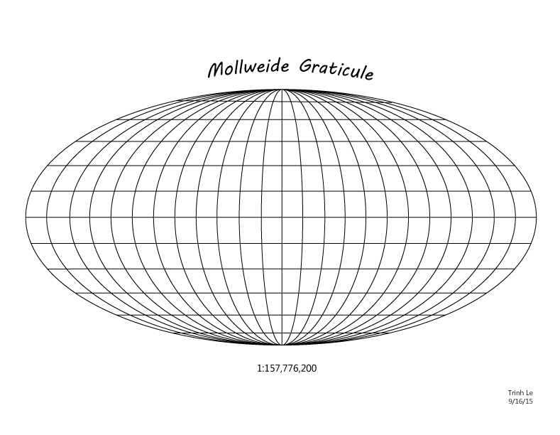
Tuesday, September 16, 2014
Thursday, September 11, 2014
Wednesday, September 10, 2014
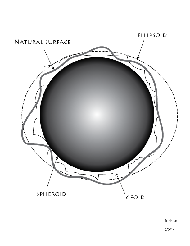
Weekly Blog #2

I find this map projection interesting because it shows the actual size of the continents versus the flattened outline of continents version for maps. It illustrates how we view the map compared to the true physical sizes of the land. The difference in size of the actual and projected map continents is huge!
Thursday, August 28, 2014
First post
This is a map that shows the most popular social networks used in different ares in the world. Map

I chose this map to illustrate how the use of internet has spread globally (such as social networking) in our generation.
Do you like geography, maps, or traveling? Click here to visit the world atlas page!
Have fun learning about history, geography, animals and more at Kid's National Geographics!
GGS310 Intro to Digital Cartography Fall '14 Class Blog
Subscribe to:
Posts (Atom)