
Tuesday, September 30, 2014
Saturday, September 27, 2014
Weekly Post #4

I think this is a very detailed map of Virginia Tech's campus that will make it very easy for the audience to read.
Saturday, September 20, 2014
Weekly Blog #3

I thought this map looked pretty cool. It's a map of the world made of texts of the name of the country at their physical location!
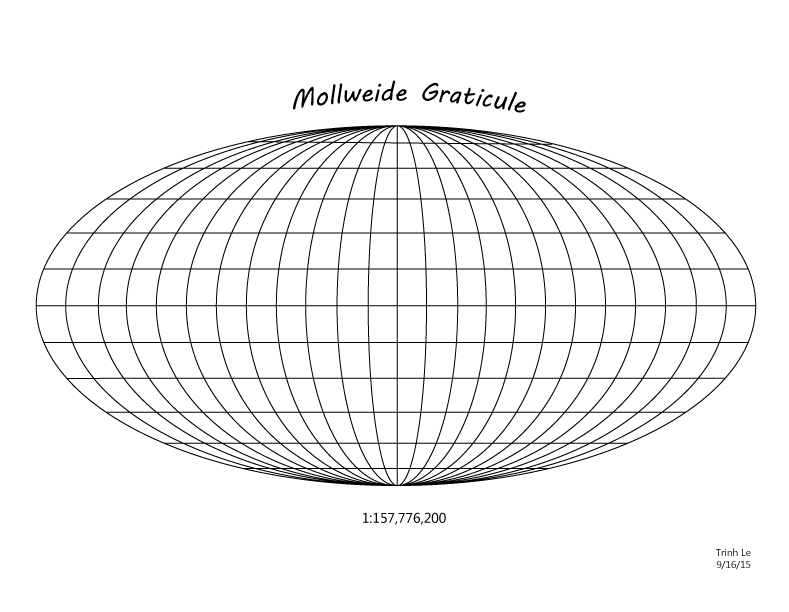
Tuesday, September 16, 2014
Thursday, September 11, 2014
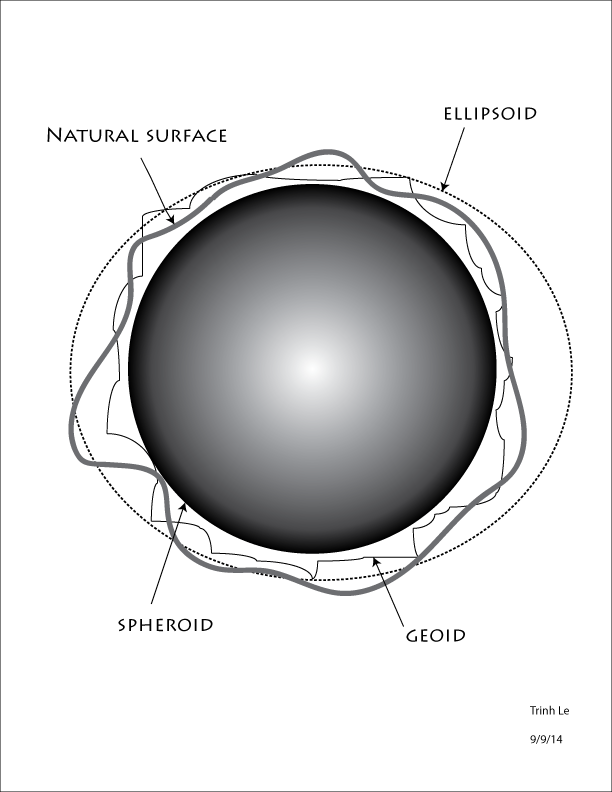
Wednesday, September 10, 2014
Weekly Blog #2

I find this map projection interesting because it shows the actual size of the continents versus the flattened outline of continents version for maps. It illustrates how we view the map compared to the true physical sizes of the land. The difference in size of the actual and projected map continents is huge!
Subscribe to:
Comments (Atom)